The Inner World
Under the hood
➝ Launch: Sept. 2nd on Art Blocks
The Inner World is a piece inspired by the richness of our inner lives. All experiences and everything we ever encounter in the end only exists in our consciousness - within. In light of this, it's debatable if there even is anything like an outer world...
Metaphors
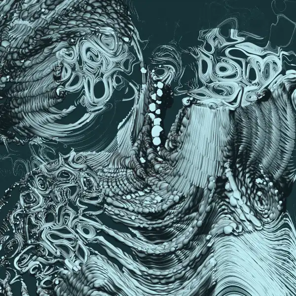
Imagine each of the pieces as a depiction of a person's consciousness, their thoughts, feelings, personality and how they perceive the world. The main visual metaphor are tendrils that represent thoughts and emotions and flow from circular cores. These cores stand for the centers of their personality, as the main representatives of their internal societies. The interaction between the various tendrils is the interaction between those parts of their personalities and their internal struggles. There's also traumas, the wounds the mind has endured that shift emotions and thoughts into high gear.
Basics
Despite looking very much like a 3D piece (mainly with one of the Regular ➝ Rendering styles), The Inner World is pure 2D. Its core idea is to draw circles or curves with drop shadows and arrange them as tendrils that flow along paths on the canvas. By drawing them close enough to each other (each tendril contains up to 3000 circles/curves) the piece creates the illusion of solid shapes in a three-dimensional environment - despite none of that being there.
Not using a "proper" 3D engine gives the pieces a dream-like quality. If you look closely you might find shadows that fall on the wrong objects or tendrils lying sometimes in the fore- and sometimes in the background. At first glance, the pieces might appear realistic but - just like the real world is re-imagined within us - it's not photo-realistic. Similar to my previous piece HYPERSCOPIC they're at an uncertain scale with a dubious provenance.
Rendering
The actual rendering algorithm in a nutshell works like this: It goes through all up to 5000 tendrils (➝ Circle number) whose starting points are layed out across a varying number of circles (➝ Placement) based on three different algorithms (➝ Layout). Each tendril consists of up to 3000 individual shapes (➝ Shape, either circles or randomly generated curves) with a predetermined radius (➝ Radius) that are flowing along a warped noise field and are rendered one after the other to create an illusion of depth. The shapes themselves either have constant size (➝ Size:Constant) or adjust it based on another noise field (➝ Size:Noise) or their on-screen position (➝ Size:Grow). Tendrils might move outside of core circles or collide with one of the three randomly placed trauma circles. In those cases, the guiding noise field's frequency increases sharply, shapes become much thinner, might change color or even be cut off altogether (➝ Freeflow, ➝ Overflow).
How the shapes are rendered depends on the overall ➝ Rendering style which falls into seven subcategories (➝ Colors). They're either generated as well or picked from a set of 12 predefined palettes.
Placements
Central to understanding The Inner World is to develop an eye for the different ➝ Placements. They determine the amount of core circles that tendrils sprout from.
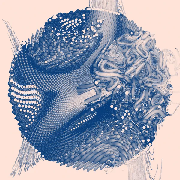
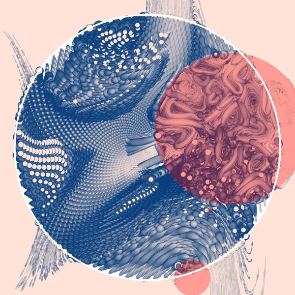
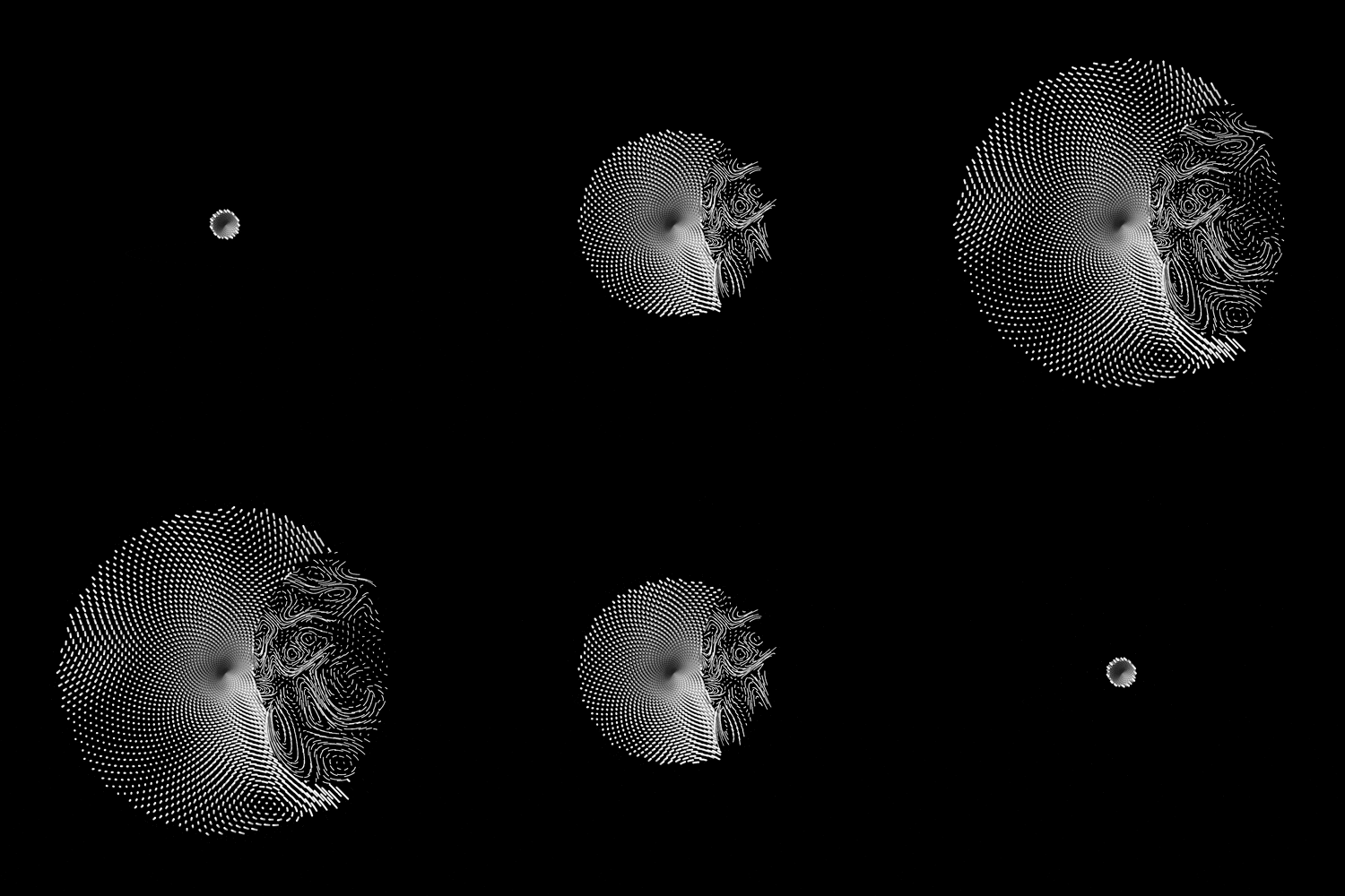
In the above - most basic - case, we have one core circle (➝ Placement:One). The three traumas are highlighted in the second image in red (notice how tendrils start to curl up more when they enter such an area, usually creating a visible border with regular areas). Note that traumas don't have lower limits for their size, which leads to one of them being quite small here.
Overall, an instance of The Inner World can fall into one of 11 types of ➝ Placement. Some of them are straightforward to spot, others less so.
Core placements: One, Orbit and Grid
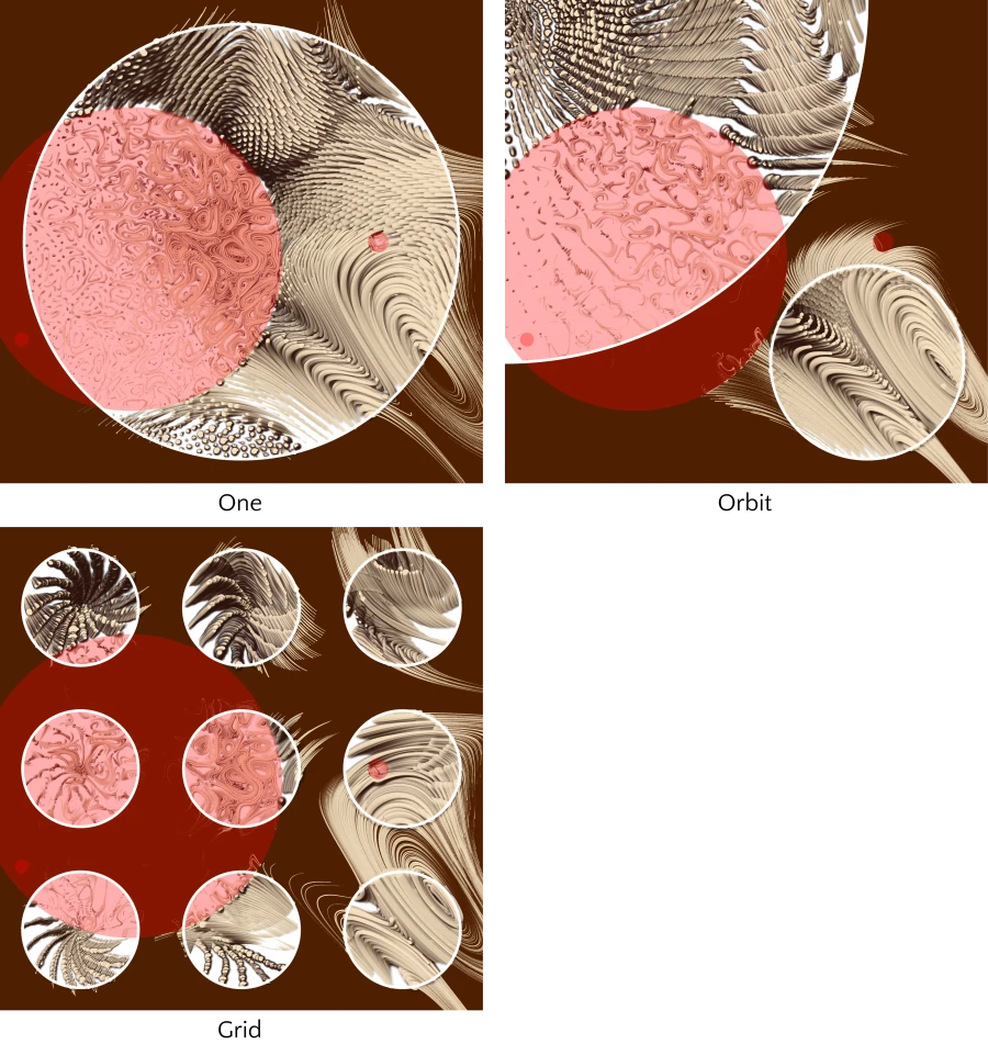
Powerful, direct placements are One (a single circle filling the canvas), Orbit (a group of two circles mimicking a planetary system) and Grid (nine circles arranged in a grid).
Random placements
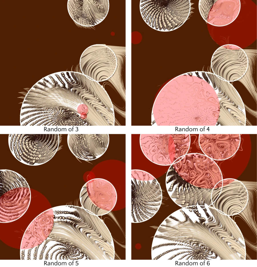
On the opposite end, the Random ➝ Placements take a number of circles and places them randomly across the canvas. They're trying to prevent overlaps, even though there is some additional (randomized) scaling applied once the layout is done.
Ring placements
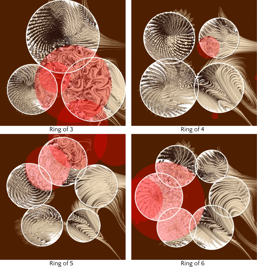
The final group of ➝ Placements arranges all core circles in a ring. The rings usually align with the image borders, going for a more symmetric look. For higher numbers of circles, there's more variations of rotations.
Freeflow and Overflow
With some pieces, it's hard to see where individual core circles end. This is due to the two parameters ➝ Freeflow and ➝ Overflow. With ➝ Freeflow being true, tendrils are no longer stopping at circle boundaries which usually has them filling up the whole canvas, creating organic walls:
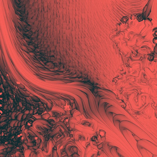
➝ Overflow is the less drastic version of this: Every tendril has a chance to ignore the circle boundaries. The lower ➝ Overflow becomes, the higher this chance and vice-versa.
Quiz time
Try it yourself! Try to find the core circles in the pictures below (and guess their ➝ Placement). Maybe you can even find the traumas? (remember: they might overlap or be very small).
You can hover over/tap on each image to reveal the solution!
Layouts
Each piece consists of up to 5000 tendrils that sprout somewhere on the canvas and move along the underlying flow fields. The logic behind their starting positions comes from the ➝ Layout parameter.
Circles
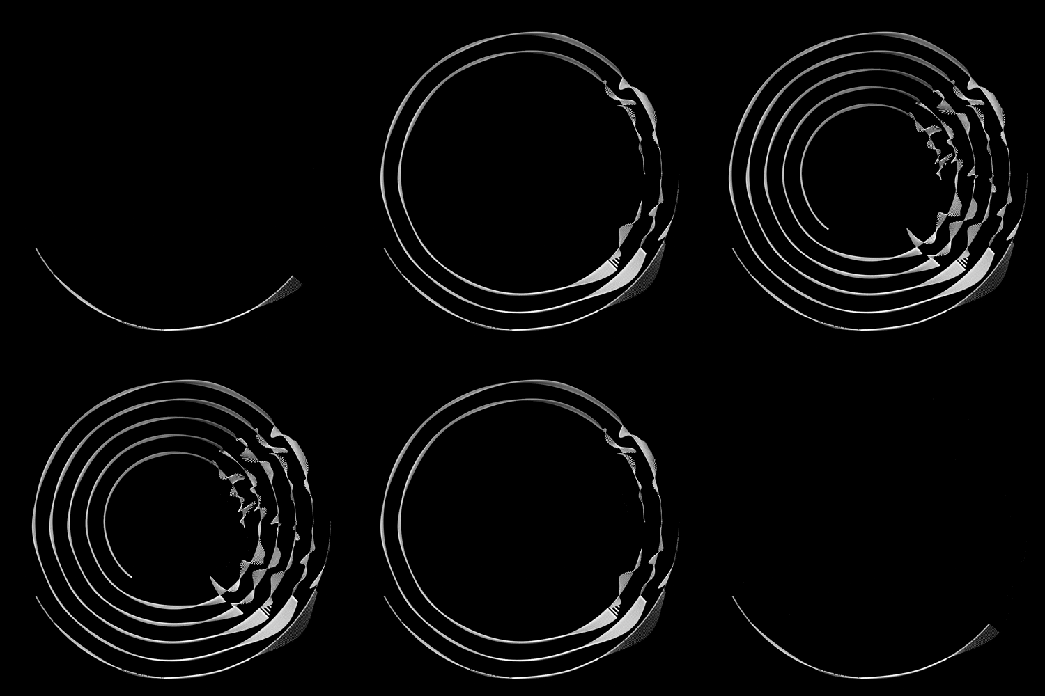
With the Circles ➝ Layout, starting positions are arranged on concentric circles, filling each of the cores (all examples here have ➝ Placement One).
Grid
Grid ignores the core circles and simply fills the canvas by going row-wise from left to right. This often leads to tendrils sprouting on "barren" areas (outside of cores), ending more or less immediately.

Phyllo
The last ➝ Layout algorithm, Phyllo(taxis), mimics the way seeds are arranged in a flower, leading to intricate spirals.
Color modes
The Inner World is playing with seven different approaches to how and which colors are applied. These ➝ Colors fall into two main ➝ Rendering styles: Illustrative and Regular. They're representing places on the spectra between abstraction, realism, playfulness, seriousness, etc.
With the emotional impact of colors on us, ➝ Colors should give you an immediate impression of what type of person's mind you have in front of you. They work with any combination of other parameters - as you can see in the following examples.
Note: The ideas for these color modes were partially inspired by Matt DesLauriers' write-up of the Subscapes project - so thank you for that, Matt!
Illustrative
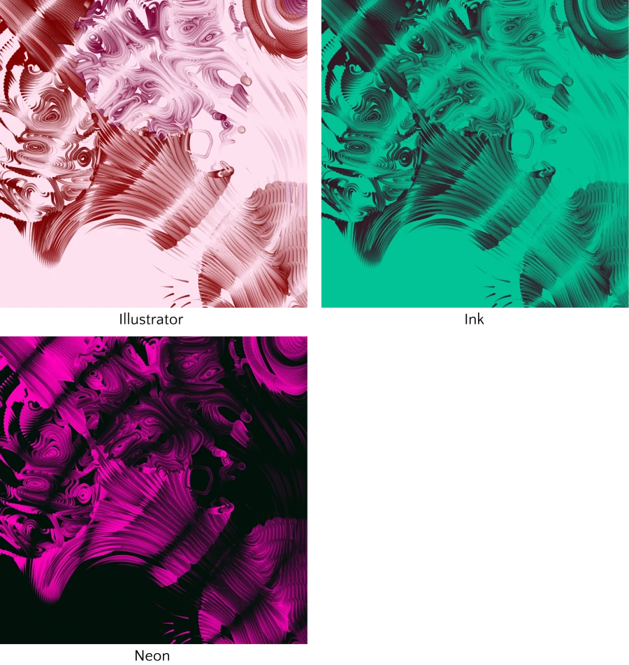
Illustrative color modes embrace the dreaminess. They have a hand-drawn feel to them and less drastic shading than Regular modes. The combinations of fore- and background colors are all generated here, without any pre-defined palettes.
- Illustrator goes for lighter backgrounds and potentially multiple foreground colors.
- Ink is more intense with properly colored backgrounds and a single dark foreground color.
- Neon has very dark backgrounds and a brightly satured foreground color.
Regular
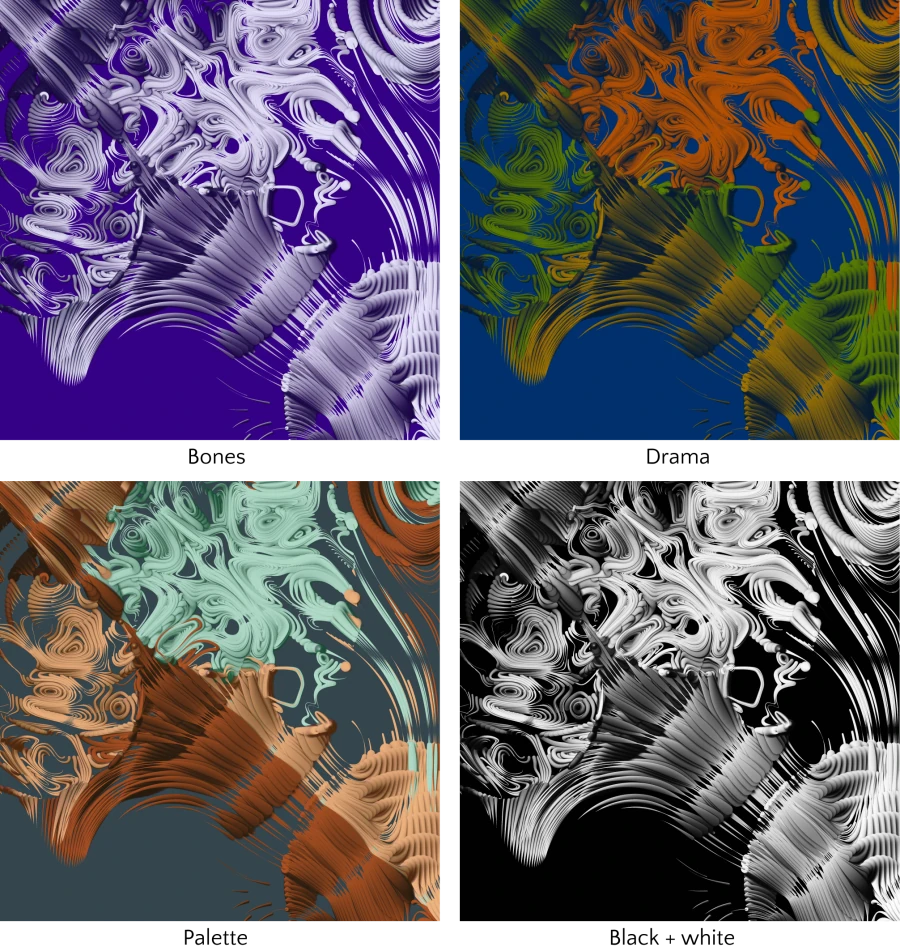
Regular color modes go for heavier shading and a more intense pseudo-3D effect. They also sometimes come with a ➝ Vignette effect that adds additional shadows to the corners of a piece. Bones and Drama generate their color palettes, while Palette and Black + white either pick from pre-defined palettes or have a hard-coded color scheme.
- Bones generates a little saturated, but very bright foreground color and a dark, velvet-y background and uses them for stark effect.
- Drama goes with potentially multiple foreground colors and applies the heaviest drop shadows, leading to sometimes quite dramatic displays.
- Palette picks from one of 12 predefined color palettes and combines them across fore- and background.
- Black + white is simple - black background, white foreground - but produces a very intense effect thanks to the applied drop shadows.
Conclusion
I hope you enjoyed this write-up of the inner workings of The Inner World! There's of course more details to this piece that I couldn't touch on.
If you have any more questions, feel free to contact me on Twitter (@dominikus) or send me an e-mail.
Also, make sure to check out all the mints on Art Blocks.